G&H Orthodontics
the miniPrevail SL deck, from a wall of clinical text to a presentation that sells the science.
Client
G&H Orthodontics
Sector
Orthodontic medical devices
Engagement
Deck redesign, messaging & motion
The project
miniPrevail SL is G&H Orthodontics' active self-ligating bracket, the kind of product that lives or dies on whether a busy orthodontist believes the science. The clinical case was strong, backed by three published systematic reviews. The deck that carried it was not: a 4:3 wall of green text, raw journal screenshots and crowded clinical photos. We kept every claim and rebuilt how it was told, into a clean 16:9 presentation system that lands the evidence in seconds, then added dynamic animation so the deck can present itself.
ClientG&H Orthodontics
ProductminiPrevail SL bracket
AudienceOrthodontists & KOLs
UseExhibit walls, brochures, outreach
DeliverablesMessaging, Deck, Dynamic animation
RoleStrategy, Design, Motion
Wall of textClarityJargonEvidenceStaticMotion
The starting point
A strong case, buried in the slides.
Every slide tried to say everything at once. Dense paragraphs, screenshots of journal pages, clinical photos packed corner to corner, all on a 4:3 canvas built for a projector, not a pitch. The evidence was there. A clinician just had to dig for it.
BeforeBeforeBeforeBefore
Real slides from the original 4:3 deck.
How we worked
We fix the thinking before the slides.
No template, no quick reskin. The same partnership we bring to every founder: strategy first, then design, then motion. The rest of this page is those three moves, in order.
01
Rebuild the message
We opened with a working session, not a design tool. We pulled the story apart, found the one claim worth making, and traded nineteen vague advantages for four, each backed by published evidence. The inventor stays an academic, never a salesman.
02
Design one system
A single visual language, clinical white and G&H green, so every slide looks like the brand and carries one idea. The 4:3 wall of text became a 16:9 frame with room to breathe and the product as the hero.
03
Bring it to life
We choreographed the builds and transitions in PowerPoint so the deck presents itself, on a loop on an exhibit wall or open in an inbox. Delivered in staged rounds, so the client steered every step.
Step 01 / Rebuild the message
Same evidence. Said so it lands.
Self-ligation arrived over-promised. Earlier marketing claimed nineteen advantages, the profession pushed back, and trust drained out of the category. So the deck's real job was credibility, not hype. We did not change the science. We changed the order: lead with the benefit a clinician feels, then hand them the published proof. The jargon stays for the doctors who want it, but it no longer has to do the selling.
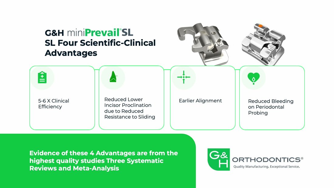
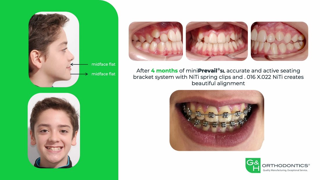
Before · feature comparison
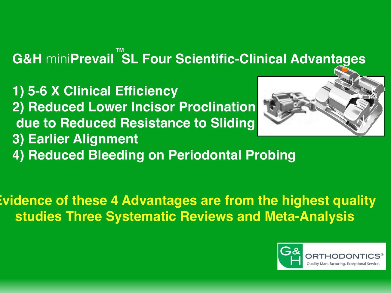
"Advantages of G&H miniPrevail SL compared to conventional ligation, supported by the highest quality scientific evidence-based studies."
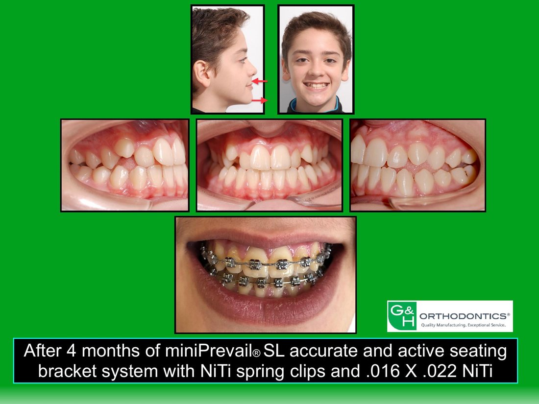
After · benefit first
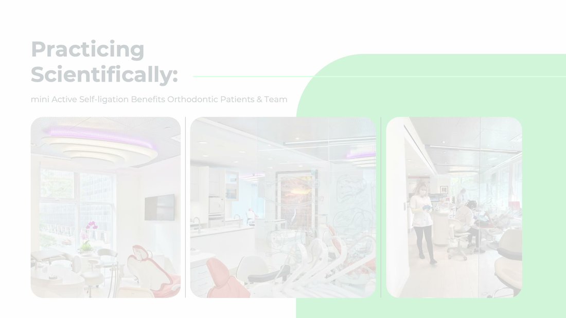
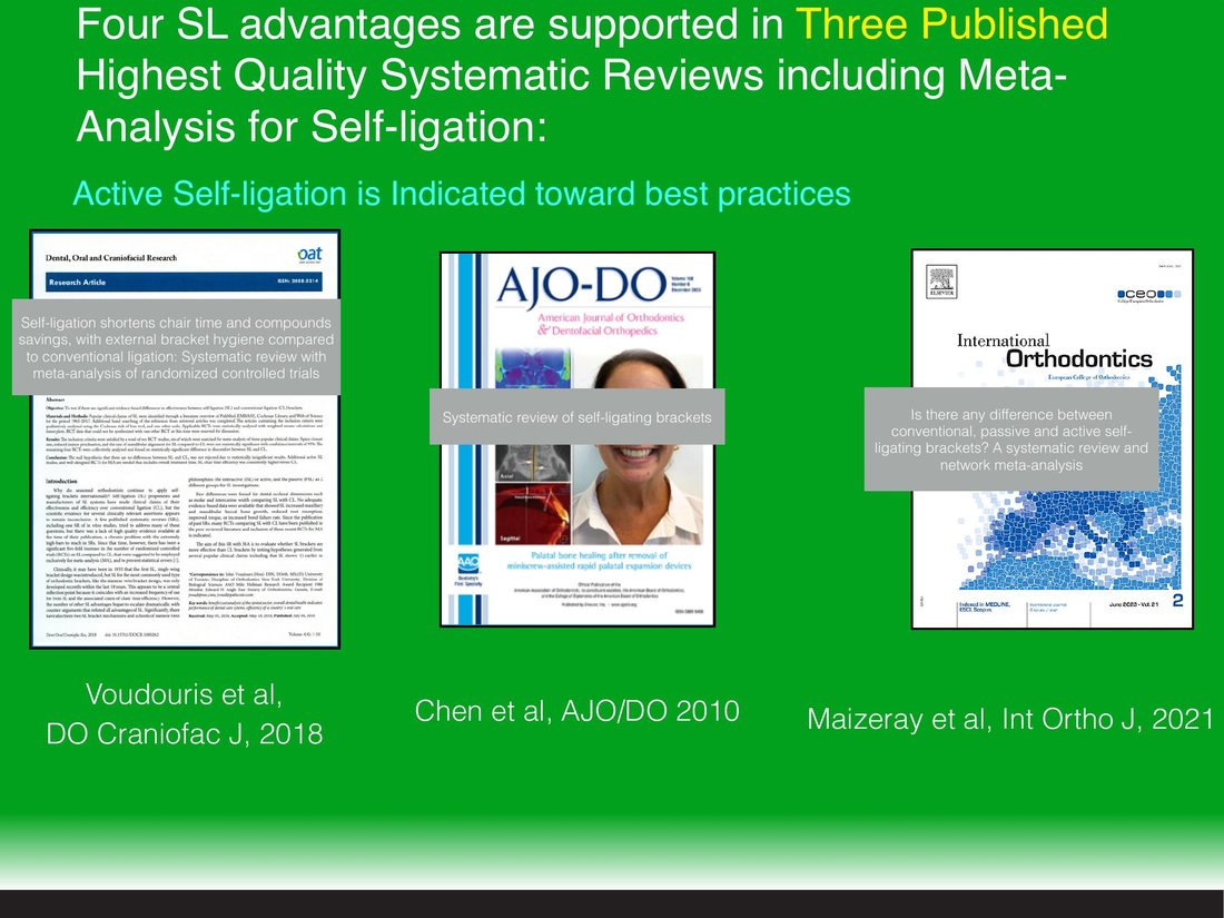
Excellence with super-efficiency. The active self-ligation bracket, proven by three published systematic reviews.
Why it works Orthodontists do not buy "advantages compared to conventional ligation." They buy a faster, cleaner result they can trust. Leading with the outcome, then the proof, earns attention before the science has to work for it.
Before · a clinical list
"5–6× Clinical Efficiency. Reduced Lower Incisor Proclination due to Reduced Resistance to Sliding. Earlier Alignment. Reduced Bleeding on Periodontal Probing."
After · four clear advantages
5–6× faster. Earlier alignment. Healthier tissue. Four advantages, each backed by published evidence.
Why it works The four claims are identical. Framed as outcomes a clinician recognises, the slide makes its point in three seconds and keeps the proclination and probing detail one layer down, for the doctors who lean in.
Step 02 / Design one system
The same slide, rebuilt to be read at a glance.
Here are the real slides, before and after. A 4:3 page of text becomes a 16:9 frame with one idea, room to breathe, and the product rendered as the hero, not a thumbnail.
BeforeAfter · live
"Active and accurate seating", the core mechanism. The claim is the same; now the bracket carries it, in motion.
BeforeAfter · live
Four scientific-clinical advantages, from a paragraph to four cards that build in, one by one.
BeforeAfter · live
The mission, lifted off a photographed printout and into the system.
The brand system
One brand language, slide to slide.
A single palette and grid, so every slide looks like miniPrevail and nothing else. Clinical white for the evidence, G&H kelly green for the brand, a lime signal for what is new.
Signal Lime#9BE85A
Bright Green#3DBE57
G&H Kelly#19A33F
Deep Green#0E8C3A
Green Black#06251A
Clinical White#EEF0E8
Step 03 / Bring it to life
Built to be presented, not read.
This deck rarely has a presenter. It loops on exhibit walls the size of five TVs and lands in orthodontists' inboxes, so the motion has to do the presenting. We choreographed the builds and transitions to reveal one idea at a time, light up the NiTi spring clip, and let the bracket renders carry the mechanism. Every frame below is the real deck, playing on loop.
100% Made in PowerPoint
What changed
From a deck you read to a story you present.
4:3 → 16:9
a projector-era layout rebuilt as a modern presentation canvas
Text → one idea a slide
paragraphs and screenshots replaced by a single clear point, built to be scanned
Static → dynamic
choreographed builds and product renders that loop on the exhibit wall, doing the presenting
Your presentation
Is your science doing the work your slides should?
If your deck makes people work to find the point, that is the gap we close. Messaging, redesign and dynamic animation, so the room gets it the moment you present.