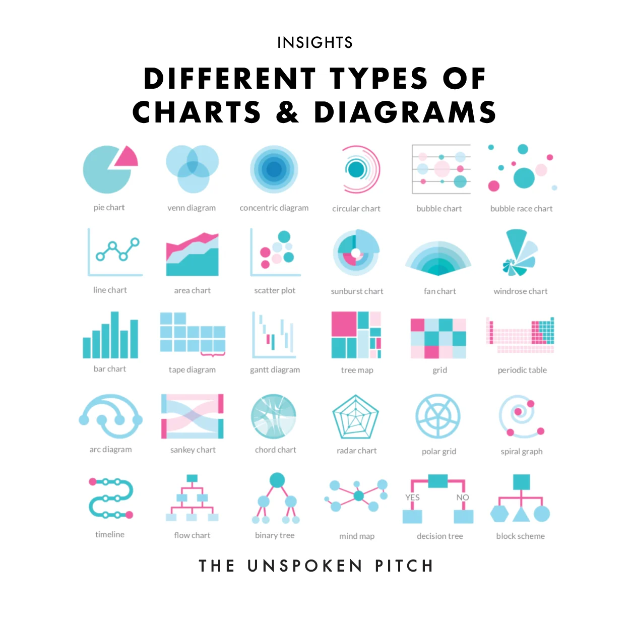
Pie chart
Parts of a single whole, when there are only a few slices.
Insights
A simple visual cheat sheet for anyone building a presentation. Use conceptual diagrams to illustrate an idea or a process — and pick the one that makes your point fastest. Our favourite is still the tree map.
The full list
Most slides fail because the data is poured into the wrong shape. The chart isn’t decoration — it’s the argument. Here’s each of the 30 with a quick note on when to reach for it.
Parts of a single whole, when there are only a few slices.
Overlap and shared ground between two or three sets.
Layers that nest or build outward from a core idea.
A cycle or stage-based loop with no clear start or end.
Three dimensions at once — x, y and size — in one view.
How ranked values change and overtake over time.
A trend over time — the workhorse of change.
A trend over time with volume or cumulative weight.
Correlation and clusters between two variables.
Hierarchy and proportion in a single radial view.
A forecast with a widening range of uncertainty.
Frequency or magnitude across directions or categories.
Comparing values across categories — clear and honest.
Ratios and part-to-part relationships, visually.
Tasks, timelines and dependencies in a project.
Proportion within a hierarchy — dense data, small space.
A matrix that maps items across two dimensions.
A structured catalogue of many categorised items.
Connections along a single line of nodes.
Flow and where volume moves, splits or is lost.
Relationships and flows between many entities at once.
One subject scored across several attributes.
Values plotted by angle and distance from a centre.
Long time series or repeating cycles, wound inward.
Events in sequence — a clear before and after.
A process, step by step, with branches and decisions.
Hierarchical splits, each branching into two.
Ideas radiating out from a single central concept.
Choices and outcomes mapped along yes / no paths.
A system shown as connected functional blocks.
Turn data into a decision
The hard part is the story the data is meant to tell. That’s what we do — turn complex information into presentations that move people to a decision.