Case Study Sales deck Messaging Dynamic design

Go CardConnect the sales deck, from a rough draft to a polished, dynamic pitch.

Client
Go CardConnect
Sector
Payments (B2B)
Engagement
Sales presentation
The project

Go CardConnect is a payments platform built for physical therapy clinics, integrated directly into the Prompt EMR so practices can take payments, collect outstanding balances and bill online without leaving their software. The product is strong, but the sales deck was a rough working draft: placeholder boxes, unfilled headings, no real flow. We turned it into a polished, dynamic sales presentation that walks a prospect from problem to "yes".

ClientGo CardConnect
SectorPayments (B2B)
PartnerPrompt EMR (physical therapy)
AudienceClinics & practice owners
DeliverablesMessaging, Deck, Animation
RoleStrategy, Design, Motion
Draft Polished Placeholder Story Static Dynamic
The starting point

A strong product, a rough draft.

A genuinely useful payments product, and a deck that was still a skeleton. Red placeholder boxes, "insert heading here", "insert video here", layouts half-filled and out of order. The bones were there. It just was not ready to put in front of a prospect.

BeforeOriginal draft slide with red placeholder boxes
BeforeOriginal draft slide, unfilled layout and placeholders
BeforeOriginal draft transaction slide, placeholder markers
BeforeOriginal draft slide with red callout boxes

Real slides from the original working draft, placeholders and all.

How we worked

We fix the thinking before the slides.

No template, no quick reskin. The same partnership we bring to every founder: strategy first, then design, then motion. The rest of this page is those three moves, in order.

01

Sharpen the message

We storyboarded the demo into a clear sales arc: integrate, get paid faster, the devices, next steps. Every placeholder became a real benefit headline, so a prospect is carried from problem to "where do I sign" without a wasted slide.

02

Design the story

A clean, confident system in CardConnect cyan and navy, with real product UI and device shots, so every slide carries one idea. The half-built draft became a sharp, finished sales presentation.

03

Bring it to life

A fully dynamic build so each capability reveals on cue in a sales meeting, and a deck that doubles as a sales video the rep can simply play. Delivered in PowerPoint, built to demo live or send.

Step 01 / Sharpen the message

Placeholders out. Benefits in.

A draft full of "insert heading here" leaves the prospect to guess the point. We replaced every placeholder with the actual benefit, and led each slide with what the clinic gets, not the feature that delivers it.

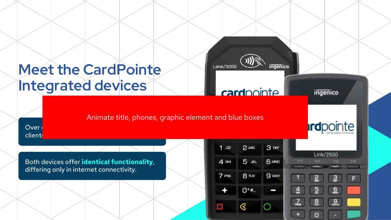
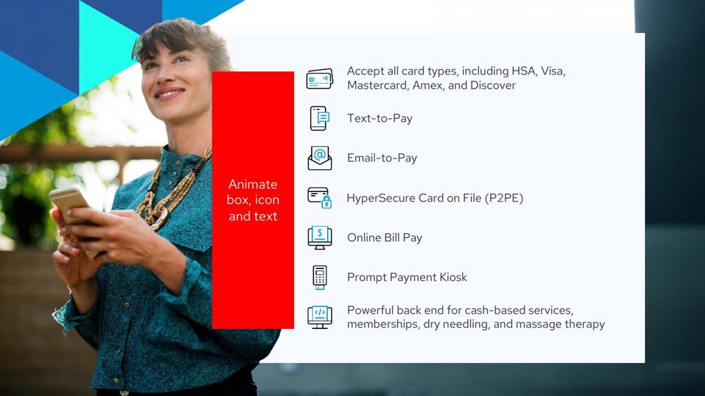
Before · a placeholder

"Insert heading text here"  over a half-built slide and a red box where the content should go.

After · a real benefit

Fully integrated into your EMR. Take payments without ever leaving Prompt, the headline a clinic actually cares about.

Why it works   A prospect skims headlines. A placeholder says nothing; a benefit headline does the selling even if no one reads the body. Every slide earns its place.
Before · a feature, stated flatly

"Email and SMS payment links"  listed as a capability, with no reason to care.

After · the outcome

Collect outstanding balances without chasing patients, one tap from an email or text and the bill is paid.

Why it works   Clinics do not buy "SMS payment links", they buy getting paid faster with less admin. Framing each feature as the outcome it creates is what turns a demo into a sale.
Step 02 / Design the story

From skeleton to finished slide.

Here are the real slides, before and after. The placeholder-filled draft becomes a clean, confident slide in CardConnect cyan: one idea, real product UI, and a clear benefit instead of a red box.

BeforeOriginal draft title slide with placeholder boxes
AfterRedesigned title slide, clean and confident

The opening. From a placeholder-filled draft to a confident, finished cover.

BeforeOriginal transaction slide, half-built with red markers
AfterRedesigned transaction-confirmation slide, clear and polished

The transaction flow. A half-built slide becomes a clear, reassuring moment in the demo.

BeforeOriginal devices slide, placeholder layout
AfterRedesigned CardPointe devices slide, clean product showcase

The devices. A rough placeholder becomes a clean showcase of the CardPointe hardware.

The brand system

One crisp language, slide to slide.

A single confident palette in CardConnect cyan and navy, so a payments pitch feels modern and trustworthy. Deep navy to anchor it, bright cyan for the call-outs, real device and UI imagery so the product feels tangible.

Sky Cyan#9FE0F2
CardConnect Cyan#00A9D8
Deep Cyan#1296BE
Navy#134056
Ink Navy#0A2236
Paper White#EEF6FA
Step 03 / Bring it to life

A demo that runs itself.

A sales rep should be able to walk a clinic through this in minutes, or just hit play. We choreographed the builds so each capability reveals on cue, and the whole deck doubles as a sales video. Below, the redesigned presentation in motion.

100% Made in PowerPoint
Go CardConnect sales deck title slide
Go CardConnect sales deck slide
What changed

From a rough draft to a deck that sells.

Draft → polished
placeholder boxes and unfilled headings turned into finished, on-brand slides
Feature → benefit
each capability reframed as what the clinic gets: paid faster, less admin, happier patients
Static → dynamic
a fully animated demo that builds on cue and doubles as a sales video
Your sales deck

Is your sales deck doing the selling, or just sitting there?

If your product is great but the deck is a draft, that is the gap we close. Messaging, clean design and dynamic animation, so every rep can walk a prospect from problem to "yes".