Case Study Investor deck Messaging Sleek design

Barton Gold the ASX investor deck, from boxed-in and busy to sleek and gold.

Client
Barton Gold (ASX:BGD)
Sector
Gold exploration & development
Engagement
AGM investor presentation
The project

Barton Gold is an ASX-listed gold developer building a 1.1 million ounce growth platform across its Tunkillia and Tarcoola projects in South Australia. Its AGM presentation does double duty: presented live at conferences and lodged on the ASX as a PDF. The story was strong, the assets real, but the deck was old-school, every slide boxed in by a hard perimeter frame, traditional and tight. We stripped the boxes away and rebuilt it sleek and spacious in black and gold, so the assets and the ambition finally have room to breathe.

ClientBarton Gold (ASX:BGD)
SectorGold exploration & development
UseAGM, conferences & ASX
AudienceShareholders & investors
DeliverablesMessaging, Deck, Template
RoleStrategy, Design, Motion
Boxed Open Busy Sleek Traditional Modern
The starting point

Real assets, in a boxed-in deck.

Genuine gold ounces, real projects, a clear growth plan, and slides that looked like every other junior explorer's. A hard frame boxed in every slide, content packed tight to the borders, maps and tables fighting for the same square inch. The information was all there. It just had nowhere to breathe.

BeforeOriginal Barton Gold project slide, boxed-in with dense maps and text
BeforeOriginal open-pit slide, framed and packed with detail
BeforeOriginal Tunkillia slide, a boxed layout of maps and notes
BeforeOriginal development-pathway slide, tight traditional framing

Real slides from the original AGM deck, boxed in by a hard perimeter frame.

How we worked

We fix the thinking before the slides.

No template, no quick reskin. The same partnership we bring to every founder: strategy first, then design, then motion. The rest of this page is those three moves, in order.

01

Sharpen the message

We started with a working session, not a design tool, walking the deck slide by slide. We landed on one consistent, confident high-level message, the 1.1 Moz growth platform, and structured the deck so the strategy holds while the numbers update each quarter.

02

Design the story

We stripped away the perimeter boxes and rebuilt it in black and gold with real white space, so each slide carries one idea and the maps and assets can breathe. The traditional look became a premium, modern listed-company deck.

03

Build it to last

Sleek, restrained motion for the conference stage, and a clean template the team can update in minutes when a resource or a number changes. Delivered in PowerPoint and PDF, built to present live and lodge on the ASX.

Step 01 / Sharpen the message

Confident, not arrogant.

Alex knew the points he wanted to make, but worried about making them too aggressively. Our job was to find the line between modest and bold: claims an ASX investor takes as confidence backed by assets, not hype. We led with one clear platform message and let the projects prove it.

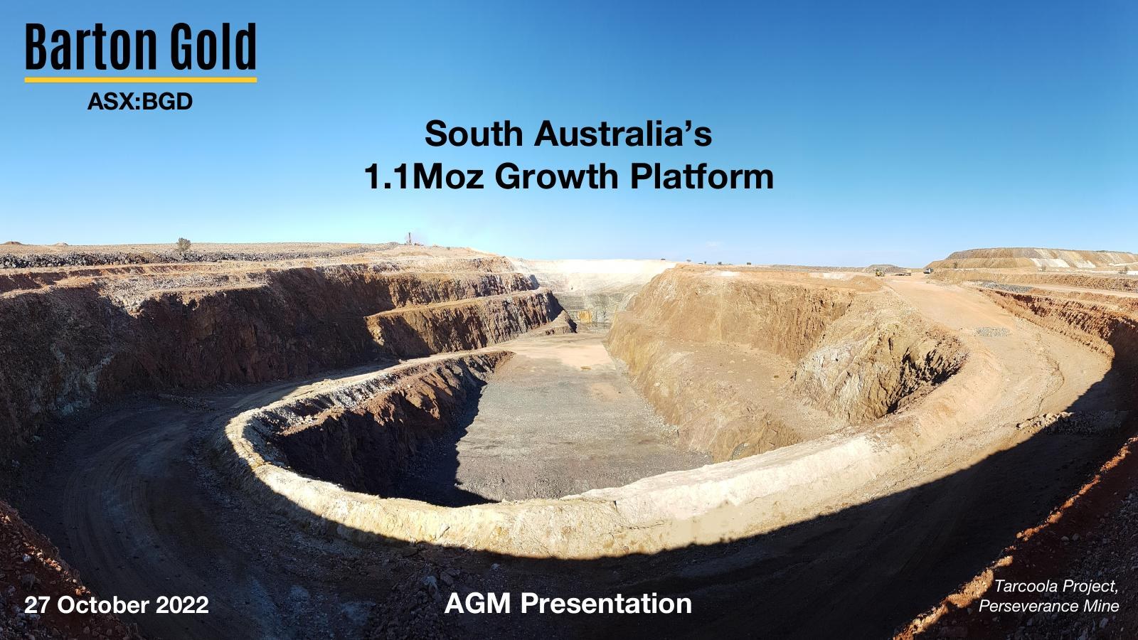
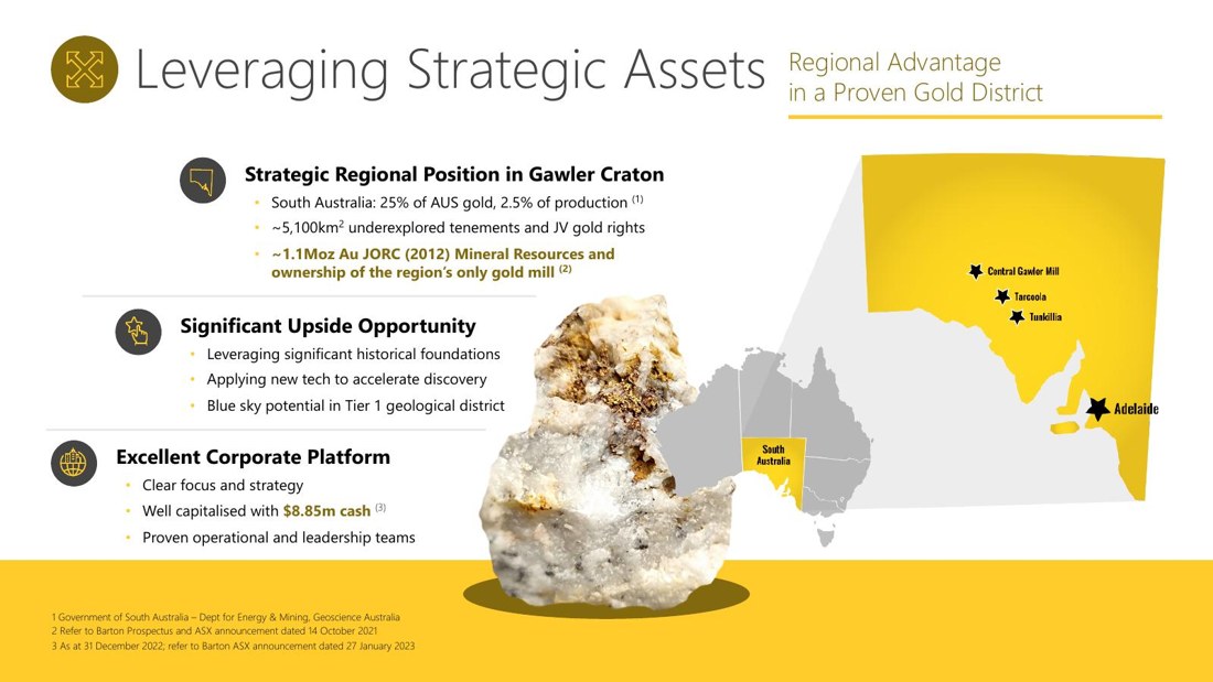
Before · a quiet subtitle

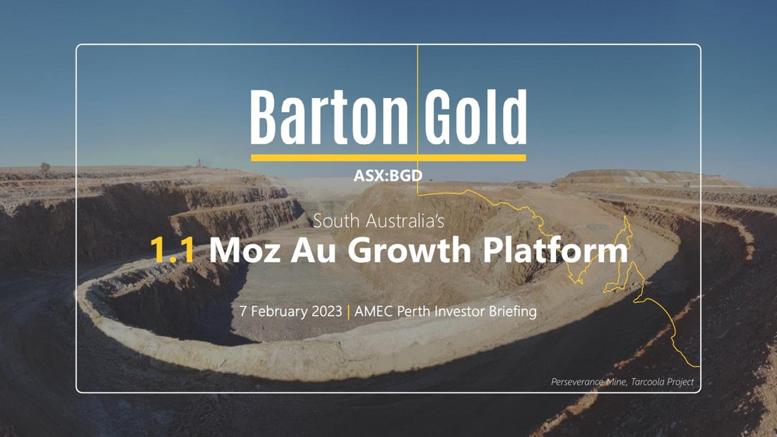
"South Australia's 1.1Moz Growth Platform"  (true, but tucked under the logo like a tagline).

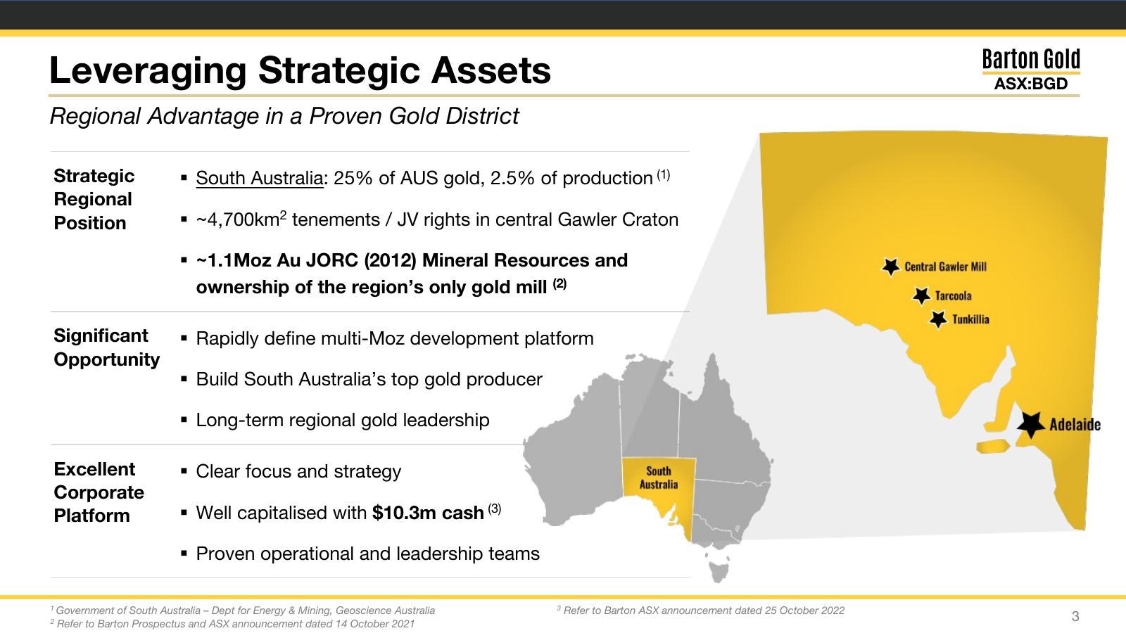
After · the headline

A 1.1 Moz Au growth platform. The same fact, made the headline the whole deck is built to back up.

Why it works   A growth platform is a bigger idea than a list of projects. Naming it once, up front, gives shareholders a single thing to remember and the deck a spine to hang every asset off.
Before · rebuilt every quarter

A bespoke layout where updating one number meant nudging boxes and reflowing the whole slide.

After · a stable template

A consistent system where the strategy stays put and only the numbers change, quarter to quarter.

Why it works   A listed company re-presents constantly. A deck built as a template means each update is a quick number swap, not a redesign, so the message stays consistent and on-brand every time.
Step 02 / Design the story

The same slide, with the boxes gone.

Here are the real slides, before and after. The boxed-in, white-and-grey frames become black and gold with room to breathe: same maps, same facts, now spacious, confident and unmistakably premium.

BeforeOriginal Barton Gold title slide, boxed and white
After · live

The opening. From a boxed white title to a black-and-gold cover that says serious gold developer.

BeforeOriginal strategic-assets slide, framed and text-heavy
After · live

Strategic assets. The frame comes off and the portfolio reads in one clean glance.

BeforeOriginal Tunkillia slide, boxed with crowded maps
After · live

Tunkillia, the 1Moz centrepiece. Crowded maps become a clear, confident flagship slide.

The brand system

One gold language, slide to slide.

A single palette of black, gold and warm cream, with no perimeter boxes anywhere. Deep charcoal to anchor it, gold for the moments that matter, real landscape photography for the ground the ounces sit in. Premium, restrained, and built to scale across every slide.

Light Gold#EDD98C
Barton Gold#C9A227
Deep Gold#A6801E
Bronze Black#241F14
Charcoal#0E0D0A
Cream#F5F2EB
Step 03 / Bring it to life

Sleek on stage, clean on the ASX.

An AGM deck has two lives: presented live at conferences, then lodged as a static PDF for every shareholder to read. We kept the motion restrained and purposeful, so it feels premium on the big screen and still reads perfectly flat on the exchange. Below, the redesigned deck in motion.

100% Made in PowerPoint
Barton Gold AGM deck title slide
Barton Gold AGM deck slide
What changed

From a boxed-in deck to a premium gold story.

Boxed → open
hard perimeter frames stripped away for white space and slides that breathe
Traditional → premium
a generic junior-explorer look rebuilt in confident black and gold
Bespoke → template
a system where the strategy holds and only the numbers change each quarter
Your deck

Does your deck look as good as your assets are?

If your listed-company deck looks like every other junior's, that is the gap we close. Messaging, a premium design system and a deck you can update in minutes, so the company looks as serious as the ground it sits on.